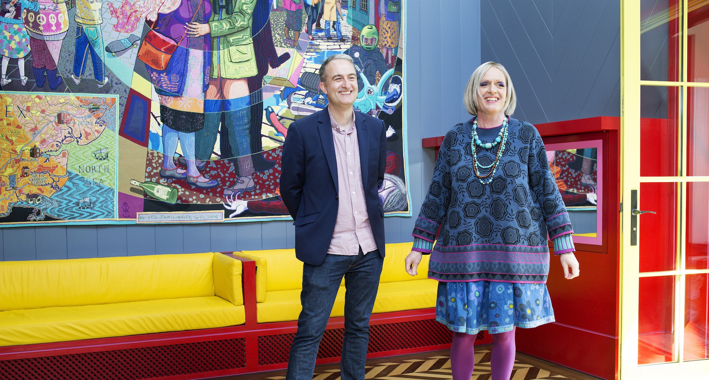
Living Architecture, set up by philosopher Alain de Botton, is a company ‘dedicated to the promotion and enjoyment of world-class modern architecture.’ It has a series of holiday homes around the UK, including the renowned Room for London on top of the Queen Elizabeth Hall. Its latest project, A House for Essex, is an extraordinary collaboration between artist Grayson Perry and the recently disbanded FAT. Former FAT director Charles Holland was in charge of the project.
How did the project come about?
Alain de Botton approached FAT after talking to Grayson Perry who wanted to build something in his birthplace Essex. It was a fascinating and attractive project for a number of reasons, not least because the brief was, “Do you want to design a temple to Essex with Grayson Perry?”

How did you choose the site?
We wanted it to reflect the contemporary qualities of Essex so initial conversations went along the lines of, should it be on an industrial estate? Round the back of Stansted Airport ? It was by no means clear that it would be a bucolic or picturesque site. But another aspect of Essex is its famous coastline and estuaries. One of the things we went to look at was St Peter-on-the-Wall which is an incredible, ancient monolithic pilgrimage chapel near the Bradford power station in this really bleak, estuary location. We then saw various places on the Crouch estuary and this one – which is on the north-east tip – really leapt out at us. It was once a farmyard and was just in the middle of a field, the last plot on the road before the road became a footpath – perfect for a way chapel.

Can you elaborate on this concept of a wayside chapel? Is it meant to be a non-sacred place of worship?
Not worship – it’s definitely a secular building – but it is a kind of temple to the narrative of Essex. Grayson’s vision was to celebrate an ordinary life: ‘Julie Cope’ is a kind of secular saint, a modern Chaucerian character in the sense that a robust everyday life is made into a heroic story. ‘Our Lady of Essex’ is about reimagining a stereotypical Essex girl as something different, taking overtones from vestries and churches. I guess it makes a ritual out of domestic spaces. The house also explores the juxtaposition between narrative and building –it’s a built story. There’s also a strong sociological narrative, Grayson describes it as a journey through classes, which is very present in the narrative of Essex – the idea that everyone there is a ‘geezer’ or ‘Essex Girl’. But Essex is more complicated than that.
Has the project taken on a life of its own? There are differences between the original plans and the finished building.
Design does evolve. At certain points the windows were more gothic/perpendicular, now they’re more exaggerated and a bit ‘pop’. We were very conscious of it as an object in the landscape, it’s very exposed and therefore such an emphatic thing to come across. We didn’t want it to fall into a stylistic camp, so we removed anything that could influence an obvious reading of the building, and we enhanced its sculptural qualities. The windows are the same shape but they’re now very clean with a bold silhouette and I think that’s more interesting. We were conscious that the building is approachable from every angle and therefore it has two fronts rather than a front and back. One of the nice things about the house is that it’s right by a footpath so you don’t have to stay there to appreciate it.

Was it a collaboration or were you servicing Perry’s vision?
Very much a collaboration. We met, sketched out plans then went away, drew them up and compared them. I think it’s a very interesting, timely statement about art and architecture. They are so divorced at the moment. Their relationship is at a historic low, unlike other stages in history, like early modernism or Bauhaus. It also came out of Grayson’s antagonism to contemporary architecture – clean, neo-minimalist interiors, bright light-filled spaces where massive windows are used to dissolve the boundaries between indoor and outdoor… We wanted to do the opposite, to create something dark and insular, to emphasise the boundaries between indoor and outdoor so there’s a real sense of surprise when you step out of it. We also both brought a real enjoyment of certain elements which are absent in contemporary architecture for example ambiguity, where the building is not given away in the first glance, or the way in old buildings not everything is perfect, there is room for the hand-made which is evident in the tiles. In effect we’ve pulled in all kind of references – stave churches, arts and craft, pop. We played around with the grammar of architecture, making illustrations and showing pictures of other buildings and amazing churches, spinning off other work. In fact it was more like contemporary art, forming collages and bricolage and appropriation. It’s an unusual tactic in architecture – architects normally hide their references, and it shows how far apart the two have become.

The house looks extraordinary and has been described as a gingerbread cottage clad in decorated pottery tiles. How does it work physically?
It’s quite normal under its decoration – the structure is blockwork with a timber roof and steel-framed dormers. The tiles are quite special however. Grayson made full-scale, one-to-one tiles and they were taken to a fantastic firm called Shaws of Darwen who made the tiles from moulds. Each tile is 50mm thick and very heavy: they are fixed with bolts and pins. Placing them was very complicated, and the triangular tiles were even worse: each one had to be interconnected. The fixing system were installation were done by a specialist faience firm called Szerelmey. The tiles are incredibly beautiful – and locked into place so you can’t nick any!

How about internally?
Well, the exterior is merely preparing you for the interior! It has two entrances, the house entrance and the ‘chapel’. From the house end the spaces get bigger and grander until you walk through into the main chapel room – there’s a sense of drama unfolding with a big reveal at the end. I’m very fond of the kitchen-dining room which is all one room, divided by a massive fireplace. The kitchen is the opposite of sleek and fitted: everything is on show, hanging pots and pans, the taps stick out. It’s all beautifully made, like a refined Heath Robinson drawing with a touch of country kitchen. The dining room is dark panelling with a Lutyens country house vibe: he would set up an epic vista then a blank at the end. The fireplace terminates the view – it’s a hidden reveal. In the upstairs bedroom a cupboard conceals a pair of doors which lead out to a kind of minstrel’s gallery overlooking the main space.

How does that work?
The living room has two ways in it’s a different space again: taller, grander with the main artworks. There are clerestory windows either side of the altarpiece which is the main focus of the house. It’s an extraordinary piece, a bit like a cuckoo clock or an advent calendar with doors that open into it. It’s very playful and theatrical – when you’re in the room you become part of the theatre. There’s a real internal logic to the house but you never know what’s around the corner: it unfolds to a climax.

What about the functional spaces like the bathroom?
We had to get into the mindset of ‘Julie’ and we had these surreal conversations like, ‘what kind of toilet would she have?’ We knew she wouldn’t have some fancy, minimal, pared-back look, more likely an avocado suite! There was a fine line between getting it right and ending up in theatre design. The upstairs bathroom is cantilevered over the hallway with a window and tiles that are the same colour as outside. At a Living Architecture talk recently, one of the audience said you might need to go into a bathroom just to have head space from the rest of the house. I suggested that they hadn’t seen the bathroom!
Originally published on Arkitexture
